Business cards are a very important piece of your brand’s identity. Not only will these cards relay your information to your client (or potential client), but if you get it right, it can do so much more!
Print on both sides
One of the biggest mistakes that we see with business cards, is not utilizing all the space that is given. By printing on both sides of your business card, you are engaging the viewer for a longer period of time which transitions into a more memorable experience.
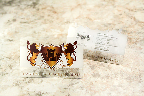
Don’t forget any information
When you receive your electronic proof, make sure that you have not skipped over any important information. A perfect way to verify that you have not left anything out is read the information on the card backwards. The most important pieces vary by business, but for most companies, these things are:
- Business Name
- Employee Name
- Telephone Number
- Email Address
- Physical Address

Keep it legible
Choosing a font is a larger piece of the puzzle than many people consider. If you choose a highly scripted font the information can be highly illegible. Including too much information can lead to a significantly smaller font size which will also make your details difficult to decipher. A few of our favorite fonts are:

Add a QR code
Create a vCard (virtual business card) in a QR code to keep the amount of text to a minimum. A vCard can include more information than you would be able to print neatly on your card.
- Website
- Business Name
- Employee Name
- Job Title
- Department
- Multiple Telephone Numbers
- Multiple Email Addresses
- Multiple Addresses
- Notes& More!

Once scanned, your client can use the QR code to save your information right in their smartphone or tablet.
Include your logo
Consider your business card a vital piece of your company’s brand. When you hand your card to a potential client, it must match your brand from fonts to colors and most importantly your company logo.

Add a splash of color
If your company has set brand colors your business card is a great place to reinforce them, however if you have not yet established your colors, it can be easy to get a bit lost. Large corporations put a lot of effort into selecting colors for that very reason.
For instance, many restaurants include the color red as it encourages appetite while many companies advertising beauty products will select purple as it represents soothing and calming.
By incorporating a little color (rather than traditional black and white) you have the opportunity to reinforce your message to your client.
Give it another purpose
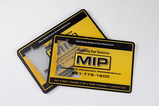
A great way to ensure that your card will be kept on hand is to give it another purpose. Although the uses greatly depend on your business, we have put together a quick list of ideas:
- Appointment Card
- Yearly Calendar
- Tip Calculator
- Punch Card
- Discount Code
- Free Service Card for Frequent Visitors

Leave space to write
Have you ever handed your card to someone and needed to add a little note? By leaving space and using matte lamination you will have the versatility to add notes as needed. If you want to give an estimate on the spot or give special instructions – you are set!
Add a photo
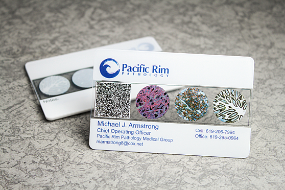
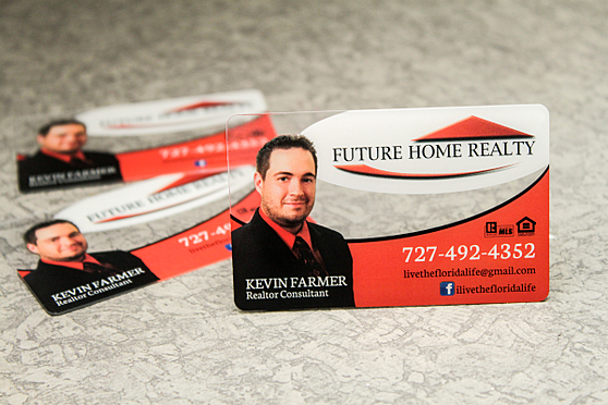
Adding a photo to your business card will make for a very unique design. Whether you select a professional portrait of yourself or an image that depicts your business (such as a home for a realtor), a photograph gives a visual for your clients to remember.
Print on plastic
While most people have a credit or debit card in their wallet, not many people have seen a plastic business card before. By handing a potential client a plastic card, you have given them a valuable marketing piece that is guaranteed to get a second look.
In the end, does your business card start a conversation or end one? 