Whenever you go out to a restaurant, do you ever see specific details? Maybe you notice the music, lighting, or the number of tables. Most of these little details are inconsequential on their own, but stacked together they can have a powerful impact on your restaurant.
Menus are one detail that you cannot overlook. You can't just throw a menu together and hope for the best; there is so much to consider. From the layouts and color to the product placement and psychology of the menus, there is a lot that goes into designing a persuasive and impactful restaurant menu. Plus, menus are the only marketing tool that almost every customer will see and touch.
Menus are a big deal. The real question is, how do you design an effective menu? They come in all types of shapes, colors, and designs. Let me show you 20 custom menus that amaze!
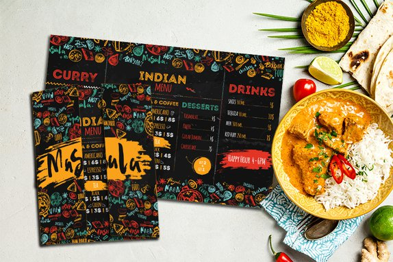
Indian Restaurant Menu
Bi FOld Menu
Wow! Doesn't this Indian restaurant menu pop? The bursts of color instantly draw you in and bring your attention to focus on the food items. When you open the bi fold menu, your eyes immediately look at the center of the Indian restaurant menu. Masala strategically outlined their main dishes, so it is the first thing that you see. What an excellent way to accentuate food items that your restaurant is trying to push.
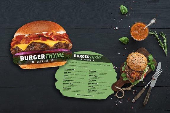
Custom Menu in a Burger Shape
This custom menu for a burger restaurant looks good enough to eat. It makes your stomach growl! The burger menu is a good representation of the food served at Burger Thyme. It emphasizes the different ingredients to show the quality of the burgers. And the die cut menu makes the customers feel like they are holding the burger right in their hands. I am ready to eat a hamburger just by talking about it. They do a fantastic job of preparing their customers for a delicious meal.
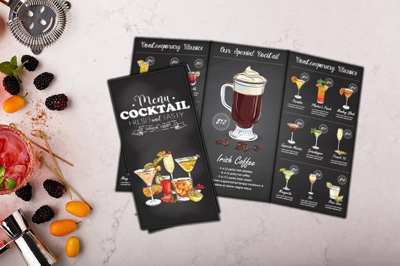
Tri Fold Menu
They say a picture is worth a thousand words, so why not add photos or illustrations to your custom menu? Images can give your diners a better idea of what a dish or drink is like, ensuring they are satisfied and helping you to promote specific items. In this tri fold menu, they promote their Irish Coffee with a delicious photo. But they don't stop there! They reinforce their promotion by labeling it as their signature drink encouraging customers to spend a little extra money to give it a try.
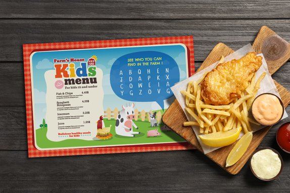
Kids Menu with Word Find Activity
Look at this adorable kids menu! The bright colors and cartoon characters give it an inviting feeling. Farm's House designed their kids menu to relate to kids of all ages. They even specify what ages qualify to order off of this custom menu. To elevate their kids menu even further, they added a word find activity to give the kids something fun to do as they wait for their meal.
Event Menu & Wedding Menu
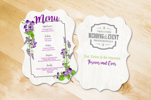
Do you have big events or weddings at your restaurant? Provide your bride and groom with an event menu that showcases your meal options in an elegant way. They want their day to be perfect, so this extra touch will help enhance their experience with you. We can customize your wedding menu to match any theme, giving your venue something a little extra.
Spiral Bound Menu
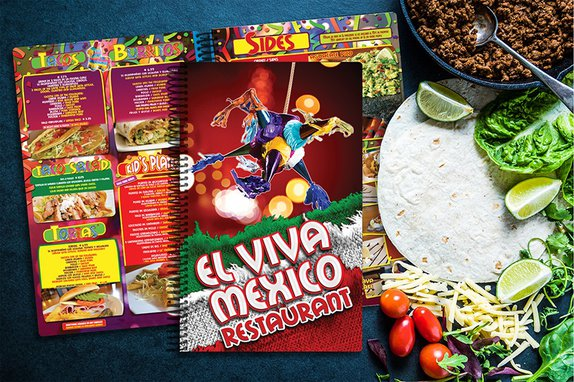
This menu design really brings out the color! Just looking at this spiral bound menu makes me want to chow down on some enchiladas. A lot of restaurant menus use color to capture the attention of diners. Red is the predominant color on this spiral bound menu. Why is that important? Because red is supposed to increase your heart rate, blood pressure, and encourage impulse eating. You might not have known that colors make an impact on your restaurant menu, but psychologists say otherwise.
Transparent Menu
It isn't every day that you see a transparent menu! A transparent menu brings the wow factor that other restaurant menus can't match. Transparent menus are bold, rare, and stunning. If you're looking for a way to make your menu stand out, this is it!
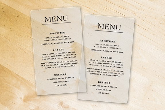
Just a quick design tip: choose a larger font for transparent menu. Small text can sometimes be challenging to read on this type of menu. Your project consultant can help ensure you get a transparent menu that is functional and eye-catching.
Drink Menu
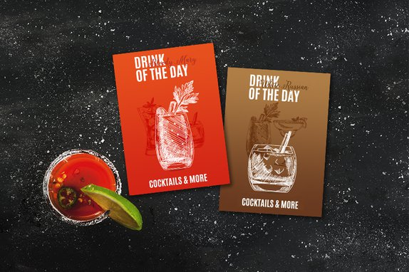
Sometimes it's best to let your food and drinks speak for themselves. This menu highlights a restaurant's drink of the day special. Special daily menus like this encourage your customers to make a quick purchase. They might not usually buy something like this, but the promotion is for a limited time, so it creates a sense of urgency.
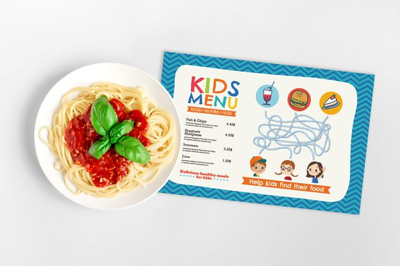
Kids Menu with Maze
One of the neat things about kids menus are all the different activities you can put on them. This menu features a maze game that anyone can play. Other game options include connect the dots, crossword puzzles, word unscrambles, spot the differences, and tic-tac-toe. Keeping children entertained allows parents to enjoy their meal with fewer distractions. Leaving both parents and kids satisfied and feeling good about your restaurant.
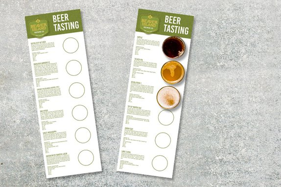
Beer Tasting Menu
Set your brewery apart from the competition with a beer tasting menu. Beer tasting menus help describe the different beers and allow customers to keep track of the ones they're trying. And once customers find something they like, there's a good possibility they'll order a full glass. Giving your brewery more business.
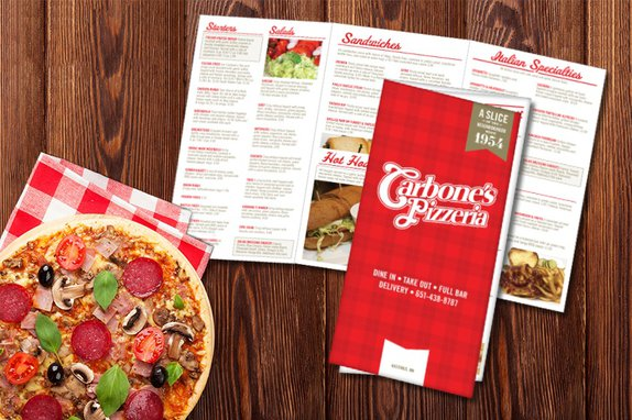
Pizza Menu
When you walk into a pizzeria, the incredible smell of the pizza should sell itself. But, in case the delicious aromas are not enough, a menu can help seal the deal. This pizza menu is a tri fold menu, meaning it folds three times. Tri fold menus give you extra space for more items or pictures of your cuisine. This style gives you the freedom to design your pizza menu to maximize revenue.
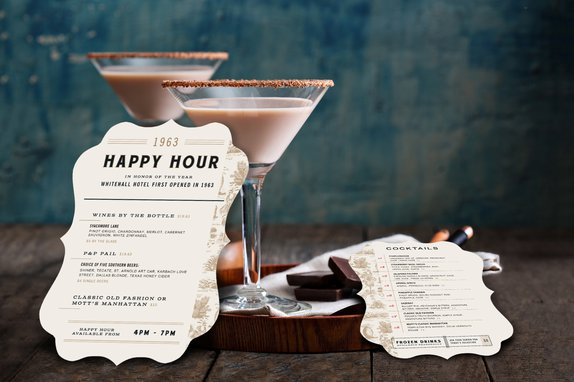
Happy Hour Menu
Spice up your happy hour menu with a custom shape! Happy hour is one of the most common specials in the restaurant and bar industry. Use a separate restaurant menu for happy hour to highlight your exclusive deals and create a feeling of exclusivity. These components help to fill restaurants and get customers to spend more on items they usually wouldn't buy. This was the original idea behind a happy hour.
Flat Menu
Seafood Menu
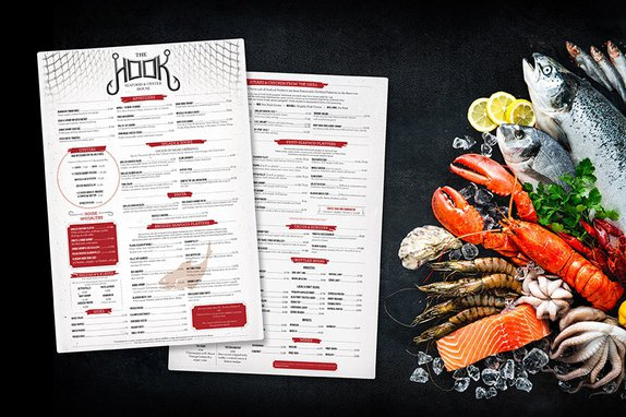
I love the little details on this seafood menu! Everything about it is a seafood lover's paradise. From the logo at the top of the flat menu to the fish illustration in the background, this seafood menu brings a lot of charm. The Hook uses its menu design to add to their one-of-a-kind experience. Showing their customers that you won't find anything else like them.
Die Cut Menu
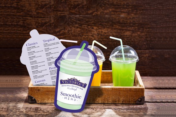
You don't need to have a large selection of food to have a menu. Victoria's Health and Organic Bar designed a small die cut menu to outline their main smoothies and ingredients. By giving their customers a die cut menu, they provide them with the ability to make an informed choice. No one wants to feel rushed! So no matter how large or small your menu is, you'll want one for the convenience of your customers.
Brewery Menu
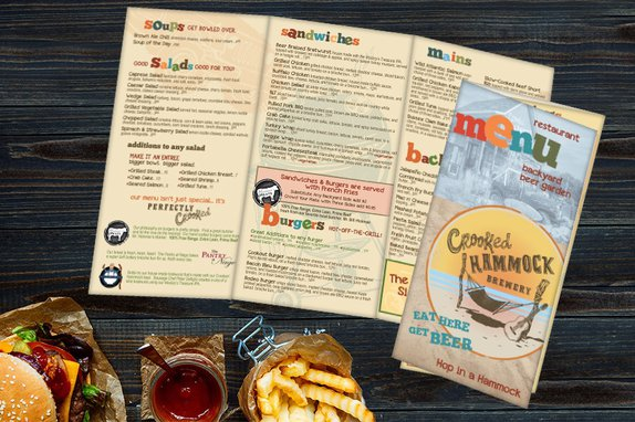
Burgers? I'm in! This brewery menu is fun and engaging. The witty remarks next to each section make me want to read the whole thing. This brewery menu shows you the importance of showcasing the personality of your restaurant through your marketing tools. It adds to the cohesive feeling and experience that you are trying to create and shows your customers what is unique about your restaurant.
Double Sided Menu
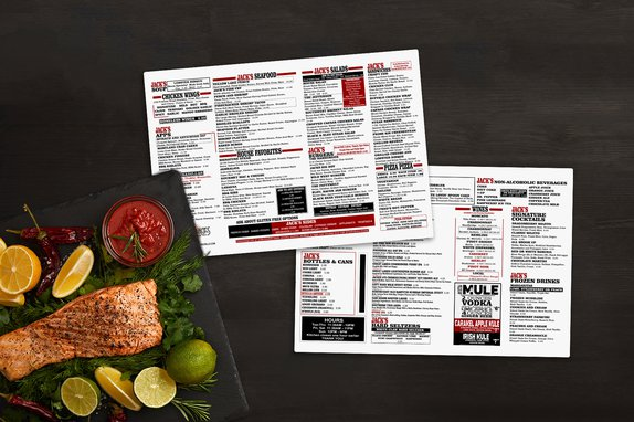
Sometimes a straightforward and flat menu is best. This double sided menu breaks up into four different columns, making it easy to read. They also add contrasting colors to highlight specials or specific dishes. The colors leap off the page, leading diners to focus on those items. Small changes in your menu design like colors and font size can have an impact on what your customers notice on your menu.
Tropical Menu
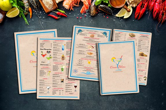
If your restaurant has a theme, it can be a smart move to incorporate it into your menu design. With the sand colored background, and images of underwater creatures, this tropical menu makes you feel like you're at the beach. And with its spiral bound feature, it contains many pages. Giving them space they need to feature different tropical items and carry out the experience.
Mediterranean Menu
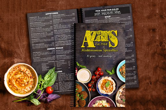
Want to know the number one way to make someone eager to open a menu? Put some super tasty food on it. Seriously, if I were eating here, this Mediterranean menu would be opened as soon as I sat down. Putting images of your food on the front cover is a great way to build intrigue. Just make sure the pictures capture the beauty of your delicious food!
Custom Menu with Frosted Accents
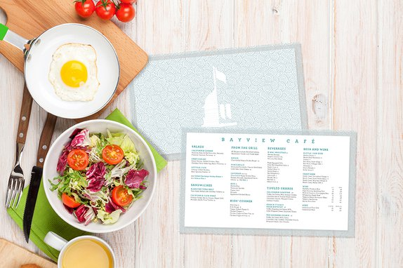
Simple but elegant, I love the spirals on the back of this menu design. The fascinating thing about this flat menu isn't the look, but the feel. These marketing tools have frosted accents, which gives it a matte look and feel. Providing the custom plastic menus with a premium quality that separates them from the rest.
Coffee Menu
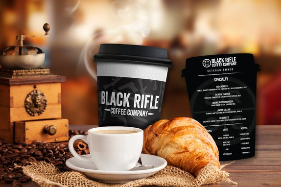
Let's cap off this list with another one-of-a-kind die cut menu! This coffee menu is designed to look just like a coffee cup. Look at the textured look on the white part of the cup; it looks real! Die cut menus are always a hit because of their unique shape. And the best part about them is that they can be made for any industry! Now these are the kind of custom plastic menus worth celebrating!
Whew, that's a lot of custom plastic menus! Hopefully, these incredible menus spark some creativity and give you an idea of how to create the perfect menu design for your business. Do you still need ideas? We have them! Whether you need ideas or have questions about menu printing for your restaurant, we are happy to help.
Share this
You May Also Like
These Related Stories
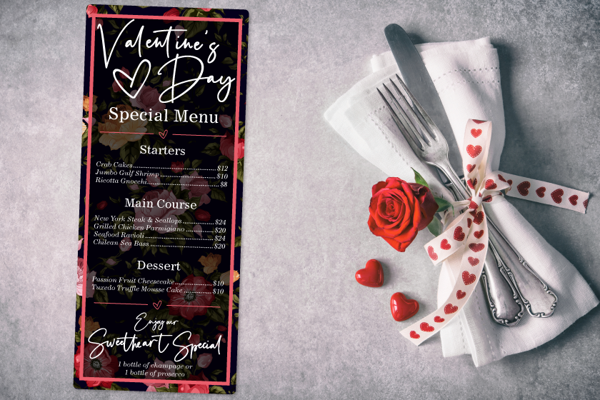
Specialty Menus for Valentine's Day
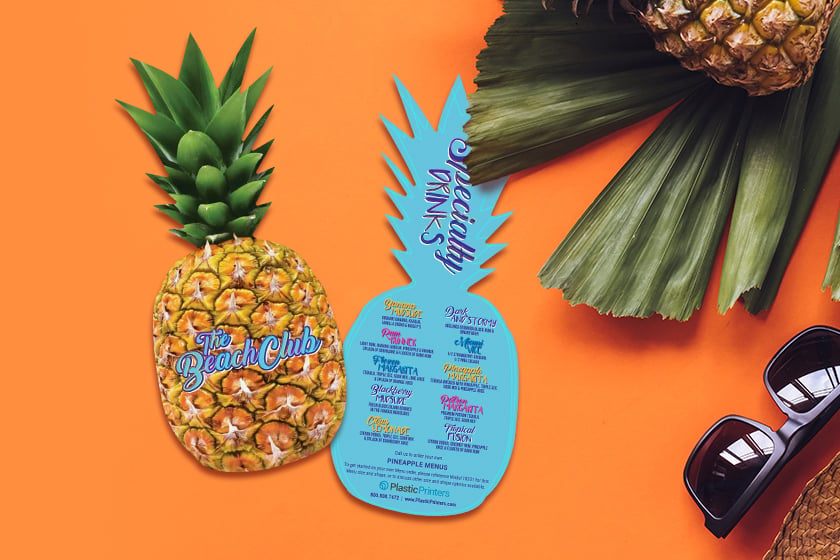
Benefits of a Bar Menu & Happy Hour Menu


.png?width=534&height=632&name=White%20Aesthetic%20Vision%20Board%20Instagram%20Story%20(1).png)