
Every year hundreds of photographers ask to see samples of business cards in their industry. They aren't sure whether they should include a photograph of themselves, an image of their client or even an image at all.
To get a better answer, we polled our office to see what cards really grabbed their attention. We see hundreds of creative cards each week, so to have a card stand out to someone here really says something.
We asked our panel of experts...

Here are their favorite photography related cards:
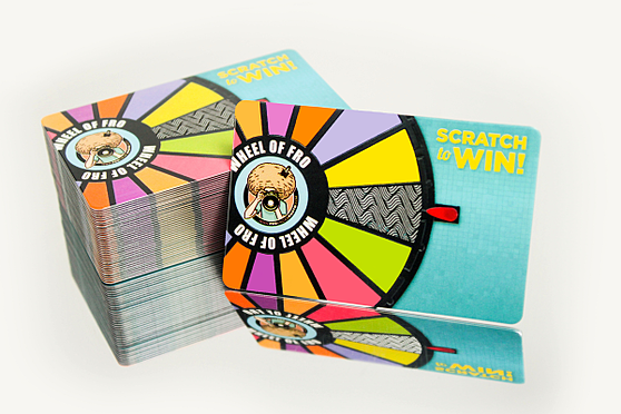
- "I love the fun colors and the promotional value of this scratch off card." - Sarah
- "Great use of color. The scratch to win is a great way to get people to keep your card." - Mike
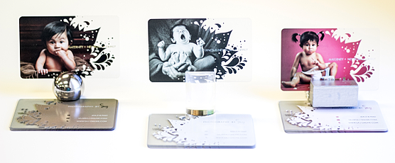
- "I love the kids photos. The images suck you in." - Kelsie
- "Unique, colorful and cute. They show what good photography can be." - Mike
- "Hand a card with a baby on it to a Mother who is pregnant, or a card with a wedding photo on it to a newly engaged couple. Ingenious, it is so smart to use an assortment of images." - Gretchen
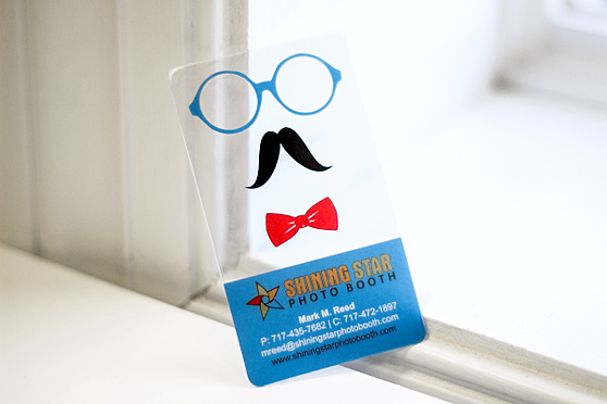
- "These cards are incredibly fun and often go viral. Not only are they fun for inside a photo booth, people are going to be showing this card to their friends or post photos of themselves with the card online." - Mike
- "I love playing with this card. Everyone that receives one is going to end up smiling." - Samantha
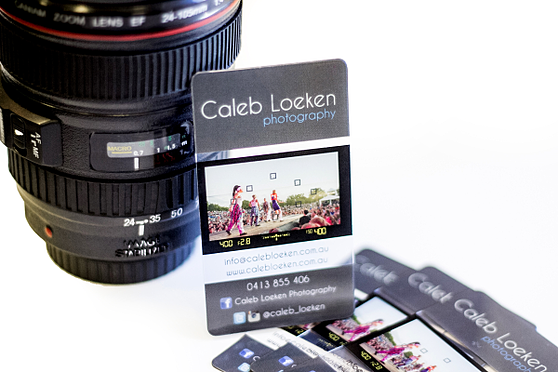
- "This card makes great use out of using a photo while keeping the uniqueness of a clear card." - Mike
- "A fun combination using the viewfinder card and including a photo. The bright colors are uniquely eye catching." - Gretchen
- "Not everyone has had the opportunity to look thru the lens of a camera, you give them a chance to try it out. Awesome idea!" - Kelsie
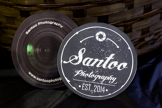
- "I really enjoy the die cut, how many people do you know that have circle cards. It is a different type of business card. I think photographers would really appreciate this style." - Kelsie
- "These cards are fun and unique. They can also be used as coasters!" - Samantha
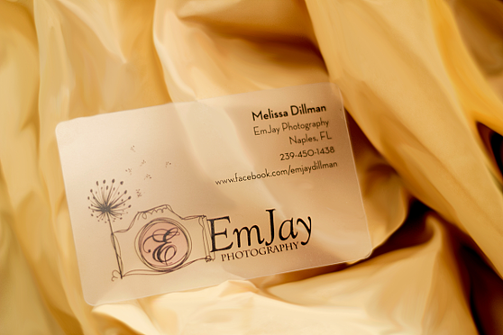
- "This business card looks more personal. I would hire her because she's the girl next door. It's cute, simple and creative which makes me feel the photographer would be too." - Kelsie
- "I love the logo. It is a very cute and playful design." - Samantha
- "This card is extremely eye catching. The design is elegantly simple without being in your face. It definitely sets the tone of the business." - Gretchen
- "The colors draw me in and I love the caricatures. It's a very fun card!" - Sarah
- "I love the colors used in this design. It is so earthy and elegant and mixed with the fun flourishes really helps brand the business." - Sarah
- "The card has a wow-factor about it. Simple and to the point yet it screams I KNOW WHAT I AM DOING!" - Samantha
- "Definitely one of my top 5 favorites. It uses both opaque and transparent areas very well. All the basic information is displayed with an example of the photographer's work, yet it is still playful and fun." - Gretchen
- "A camera shaped business card, need I say more?" - Mike
- "My kids love playing with this card. I am sure that if you take pictures of children or families that it will be a great distraction for the kiddos while working too!" - Samantha
There is not just one way to get people's attention with your business card. The key is making sure that they are brand consistent (colors, fonts, icons, etc.) and ensuring that all of your information is current.
Not quite sure what you want for your business card design? Let our experts put something together for you!
