Businesses in all types of industries have found that membership programs are an excellent way to encourage customer retention and spending. The New Year is a new opportunity for your membership program to grow and flourish. However, there are countless membership programs available to consumers, so you'll need to consider the best way to set your membership program apart from competitors.
One easy way to differentiate your membership program is to create an eye-catching and memorable membership card design. You might be wondering what an effective membership card design looks like, and the truth is that it comes in a variety of shapes and sizes. Let's go over ten membership card designs that can inspire you and give your membership program a boost in 2021.
Membership Card Design That Paints A Picture
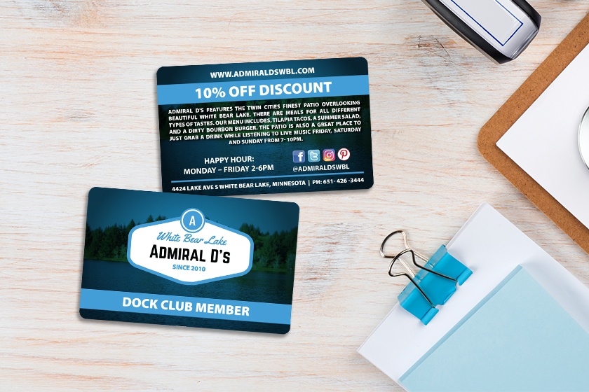
One strategy for your membership card design is to paint a picture that showcases what's unique about your business. For example, Admiral D's membership card incorporates a beautiful waterfront scene, which captures the beauty their patio has to offer. Using your design to highlight what makes your business different helps further differentiate your business and membership program from competitors.
Bring Shine to your Membership Card with Foil
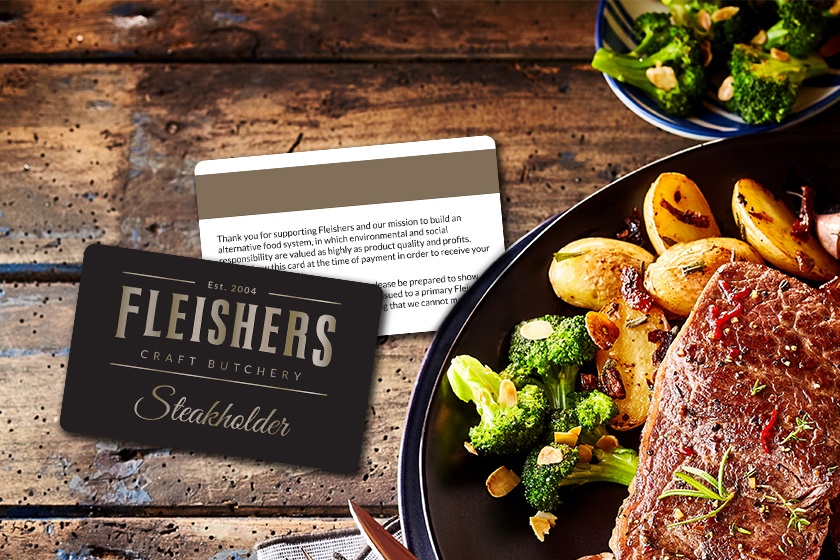
Foil is an underutilized design feature that can really help make your membership cards memorable. Fleishers Craft Butchery brought some shine to their membership card by using gold foil on their name. Foil shimmers and shines and brings an extra dimension to your cards. It should be noted that gold is just one foil option; you can use just about any color you'd like.
Brightly Colored Membership Cards
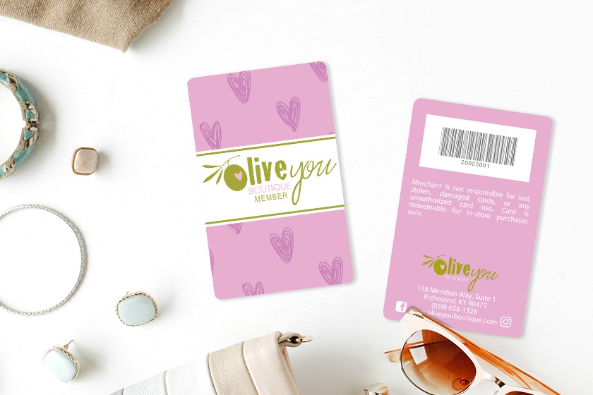
Cool features like foil aren't the only way to create an eye-catching design; bright colors are perfect for that as well. Olive You Boutique used a bright pink color that really grabs you. Additionally, the pink color is an excellent contrast from their logo, which is mostly white and green. Color contrasts can be a powerful way to attract eyeballs to your design, even more so when the colors are bright.
Embossed Membership Cards
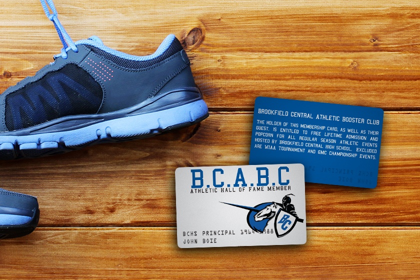
Add depth to your membership cards with embossing. Not sure what embossing is? You've probably seen it on credit cards; it's the raised lettering or numbers. Embossing is a great way to highlight important information or make your membership cards give off a sense of luxury.
Multi-Tier Gym Membership Cards
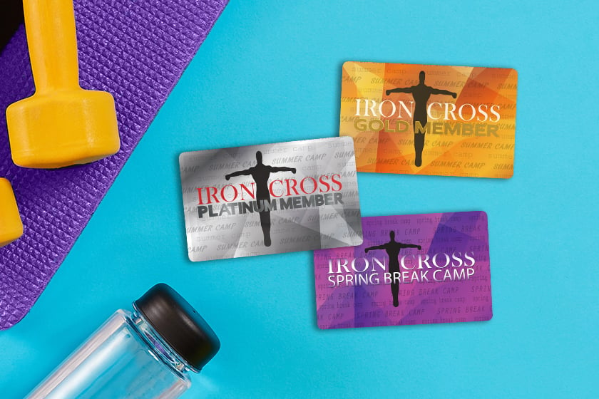
Many membership programs feature different tiers, levels, or options. If that's the case with your membership program, you can help differentiate the programs by using different designs. Iron Cross used different colors and text on their membership card designs to make their different tiers clear to members and staff. It's a tactic that many gyms, restaurants, and retail businesses use for distinguishing their various membership options.
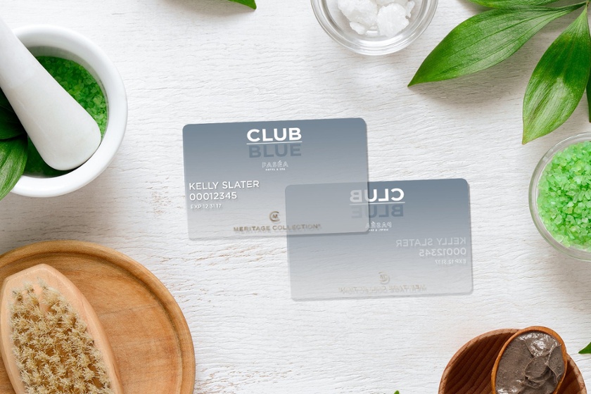
Membership Cards with a Frosted Design
Look at the way these Club Blue membership cards stand out! Pasea Hotel & Spa used our frosted feature to create a one-of-a-kind membership card that customers love. As you can see, with our frosted feature, the cards are partially translucent. However, unlike clear cards, they have a matte look and feel that helps give off an upscale vibe. Frosted membership cards are a bold look that is sure to capture the attention of your customers.
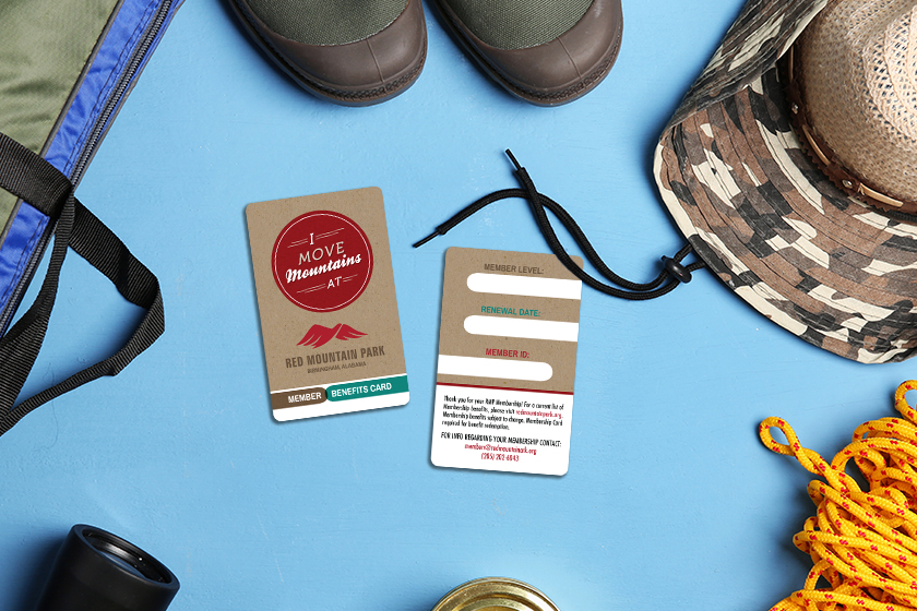
Writable Membership Cards
Do you have important information you need to write on your membership cards? Writable panels make that a possibility. Red Mountain Park uses three writable panels to track membership level, renewal date, and member ID. However, that's just one example; you can use your writable panels on your membership cards to fit your business's exact needs.
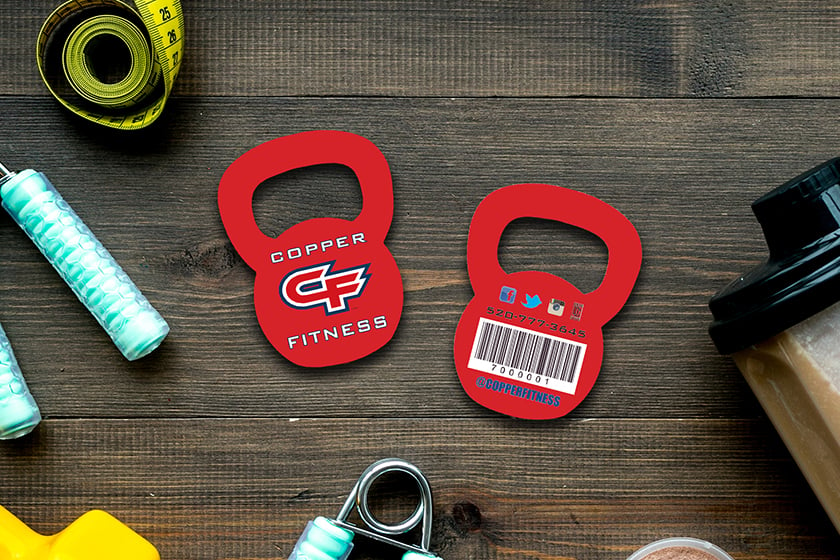
Custom Shaped Membership Cards
Highlight your industry, logo, services, or more by using custom shapes. Copper Fitness used a kettlebell shape for their membership card for a unique design that sets them apart. Using custom shapes is a fantastic way to draw attention to your membership program. Display your custom shaped cards, and you'll be sure to have customers asking about them and how they can get one.
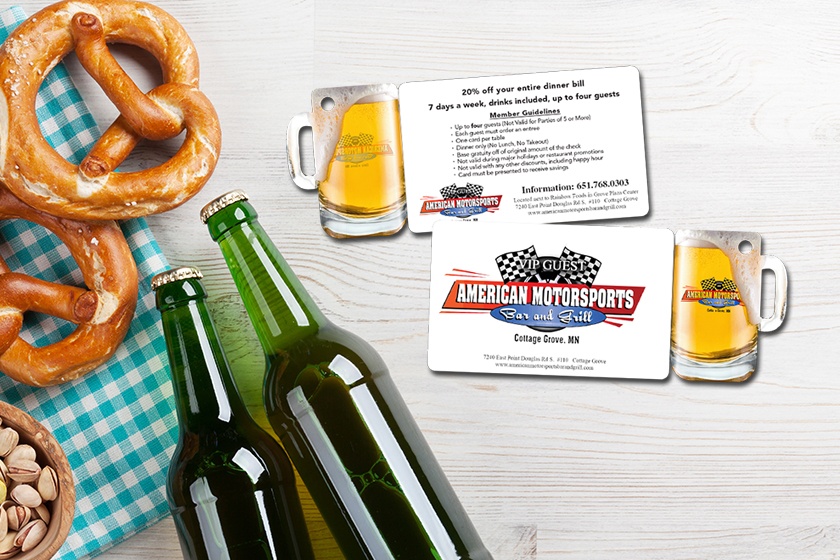
Combo Cards - Two Marketing Tools in One
American Motorsports Bar and Grill uses combo cards to give members two marketing tools, a membership card, and a key tag. Their key tag is a custom shape and designed to look like a mug of beer, perfect for their bar. Combo cards are a great way to get the most bang for your buck; customers will be able to put their membership card in their wallet while the key tag will attach to their keyring, going with them everywhere they go.
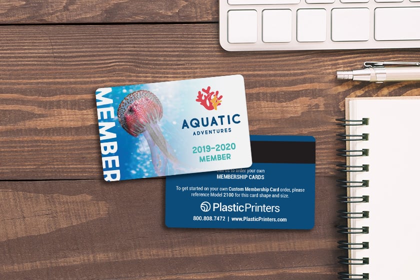
Membership Cards an Eye-Catching Image
Sometimes the best way to create an impactful design is with a striking image. Aquatic Adventures uses images of their sea creatures in their design to make them easily identifiable and remind members of what's waiting for them. They say a picture is worth a thousand words, and that can certainly be true in your membership card design.
There you have it, ten amazing membership card designs to inspire you. If you need more inspiration, take a look at our inspiration gallery. Do you want help designing your membership cards for the New Year? We have you covered; Plastic Printers has an incredible team of graphic designers on staff who will be happy to get you the perfect design for your business. If you're ready to get started or have any questions, don't hesitate to reach out!
Share this
You May Also Like
These Related Stories
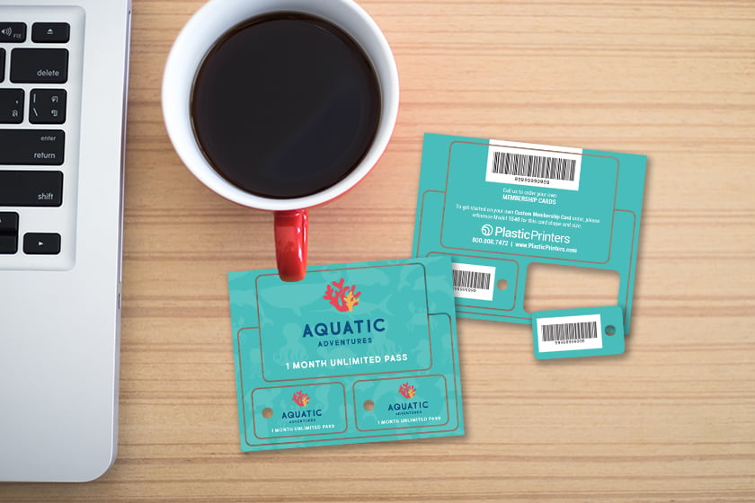
How to Guide for Starting a Membership Program
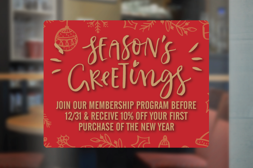
How to Advertise Your Membership Program for the New Year
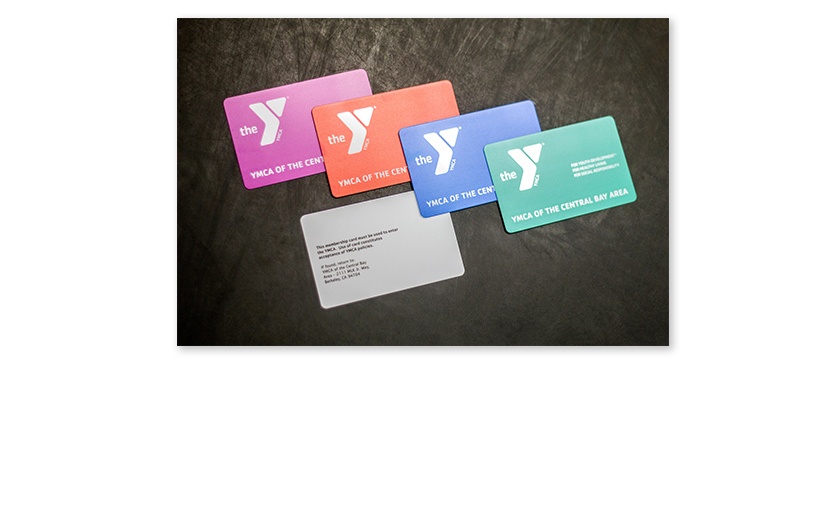



.png?width=534&height=632&name=White%20Aesthetic%20Vision%20Board%20Instagram%20Story%20(1).png)