It’s no secret that gift cards are a strong investment for businesses in all sorts of industries. Gift cards are the number one requested item every holiday. The gift card market grows 10% annually, and approximately 72% of consumers will spend more than the total value of their gift card when making a purchase. All it takes is to make sure that your card is the one that gets taken off the shelf, and one of the best ways to accomplish that is through an amazing design. It can be daunting to design a gift card that perfectly reflects your business, so here are some tips and strategies to get the most out of your gift card.
What You Need To Know To Design A Gift Card
Brand Consistency
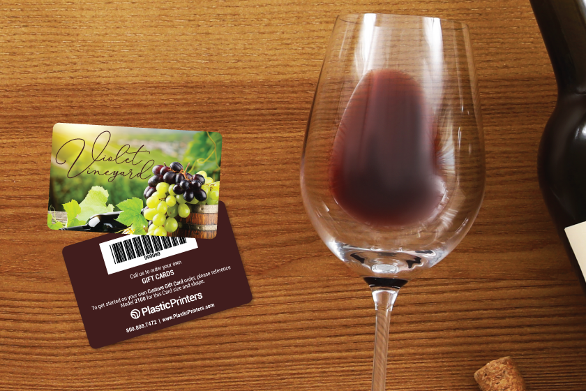
Unlike business cards, gift cards don’t have to sacrifice space to convey information, leaving the card’s design far more open to color, creativity, and branding. A gift card should be immediately recognizable as yours, and as such, should maintain a branded consistency the whole time. If your brand has a specific color used in marketing or logos, you should let it shine in your gift card design. Consider a gift card an advertisement for your business that travels in your customer’s wallet, so the clearer and more appealing your brand and logo can be on your card, the better.
Shapes and Sizes
Most gift cards keep a uniform size; the standard is 3.375“ x 2.125” and .03 inches thick. This size is the same as a credit card and will easily fit inside a wallet. Though this is the most popular size, that doesn’t mean that you can’t explore other shapes, sizes, and possibilities. Here are a few ideas that could be worth considering for your business.
Corners
Simple changes like rounded corners, straight corners, or cut corners will have an impact on both your customers and your card’s size. Rounded corners are the most common, and that choice makes sense; they are the most portable and fit easily into wallets. Sharp corners often look more professional but are less efficient in their portability. Cut corners can add a little more to your design and throw some creativity on your gift card design without sacrificing its efficiency.
Custom Shapes
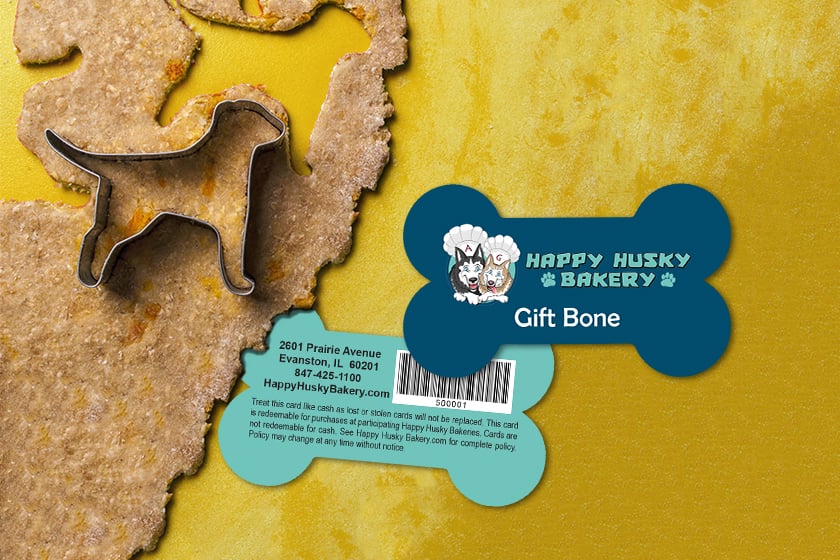
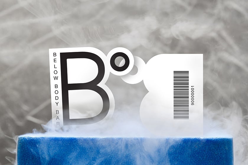
Custom shapes that fit your brand can be one of the premier ways to help your gift cards fly off the shelves. If you identify a shape that meshes well with your brand or shows off what you do best, then customize your gift card design to show it off! If you’re a coffee shop, shape your card like a coffee cup. A brewery could shape their card like a pint. It may alter the card’s size, but it instantly becomes more memorable than a standard gift card’s shape and a selling point in itself. There are hundreds of different possibilities when it comes to representing your work through shape, and you can explore some of those possibilities here.
Size and Thickness
When it comes to exploring other possibilities with your size and thickness, there are pros and cons to each choice. If your card is too big, it may not fit in a wallet, but if it’s too small, it may get lost in a wallet. If you make your card thicker than the standard size, it may be too cumbersome to fit into a wallet, and any thinner, it could lose its durability. The choices are up to you and your business, and it all comes back to brand consistency. If it comes down to showing off what your brand can do best, no size customization is unreasonable.
Color and Text
Gift cards have an exciting freedom in their aesthetic choices, leading to all sorts of design options. Many choose to go with a minimalistic approach, choosing to promote brand colors and logos as the most prominent aspect of the card. That’s not to say you can’t load your card up with info; the best strategy is to use the space on your card as a travel advertisement, and however you choose to utilize this space is up to you. However, there are several ways to accentuate the presentation of your card
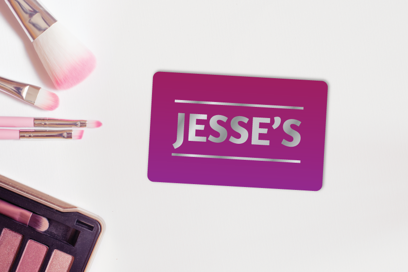
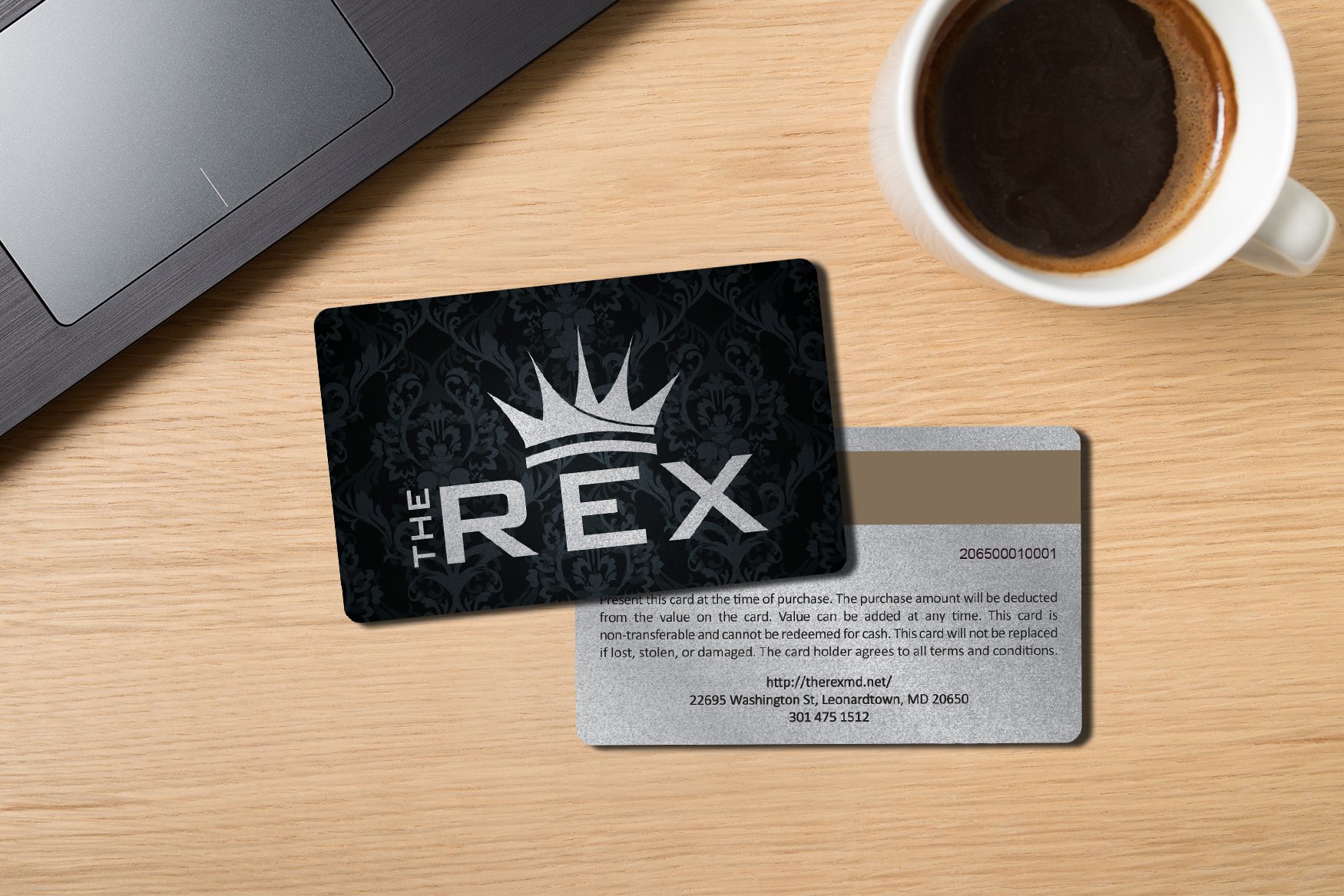
Finishes: Choosing a finish can help elevate your card’s presentation. Depending on what impression you’re trying to leave, there is a type of finish for you. Foiling or foil stamping is a premium printing method that involves creating a custom metal die of your gift card design. Uncoated business cards have a natural look that puts the focus on your logo. Add shine to your gift card design and make a powerful first impression and statement with a glossy finish. There are many more to choose from, and each can help in a different way.
Color: While designing your card, you might be asked about your color options, which look like this: 4/0, 4/1, 4/4. This may look complicated at first glance but are actually rather simple. 4/0 means only one side of the card is full color, and the other side will be fully blank. 4/1 means one side is full color, while the other side won’t have full color but may have text on it. 4/4, then, means full color on both sides. Beyond the color placement on your card, it should maintain consistency with both the material and your brand. Using your card and your brand together can produce an eye-catching card without any extra work!
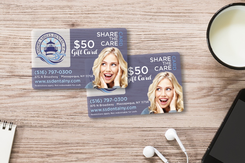
Styles: Your gift card design doesn’t need to be as standard as picking rounded or traditional corners; your card’s design is limited only by your creativity. There are plenty of different styles you can choose for your card to make it stand out from the heaps of other cards. This can be anything from utilizing a transparent card design to emphasize your logo to designing a gift card that is shaped like your best product; there are plenty of extra customization choices.
Getting the perfect gift card design for your business can help boost sales and take your marketing efforts to the next level. For more information on your gift card design choices, try out a free consultation here.
Share this
You May Also Like
These Related Stories
Why Your Business Needs Its Own Custom Gift Cards
20 Inspirational Gift Card Designs


.png?width=534&height=632&name=White%20Aesthetic%20Vision%20Board%20Instagram%20Story%20(1).png)