- Plastic Business Cards
- Gift Cards
- Key Tags
- Custom Products
- Custom Plastic Cards
- Resources

From transparent to custom-shaped to a more traditional card, your customization options are limitless. Whether you want to use these designs or come up with your own, these examples can help guide you through the design process.
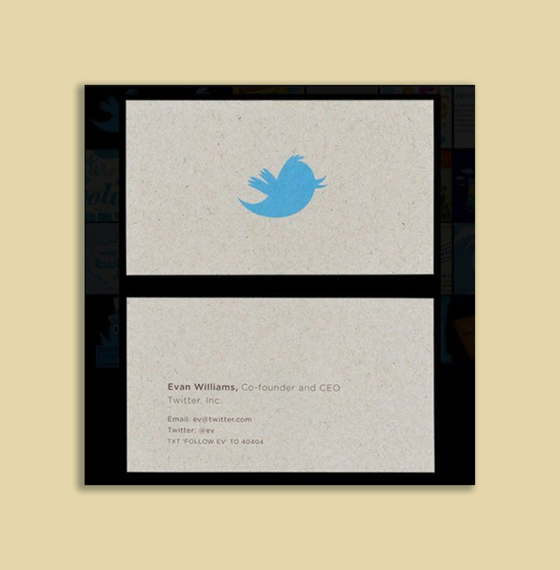
The card of an animator should be as artistic as the card’s owner. With Chuck Jones, you don’t even have to know his profession, you can simply tell by the card. It’s as visually interesting as it is informative, simple but inventive, and shows exactly how creative a card can be.
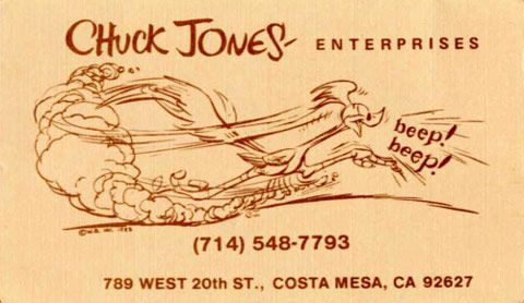
A famous card, and maybe not one that should be emulated, Mark Zuckerberg sought to make a statement with his card, and what a statement he made. The card itself is minimalistic, the font is consistent with the brand, and you learn exactly who the owner of the card is.
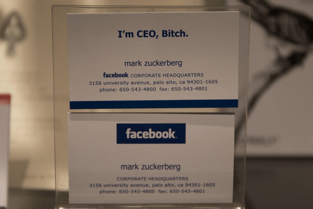
Jerry Yang chose a vertical business card for his Yahoo representation, and it covers two fronts at once. First, it gives you a full rundown of all relevant information quickly and succinctly, and second, it heavily features an eye-catching and colorful logo. Vertical cards aren’t as common as horizontal cards, so this is a good example of how to do it well.
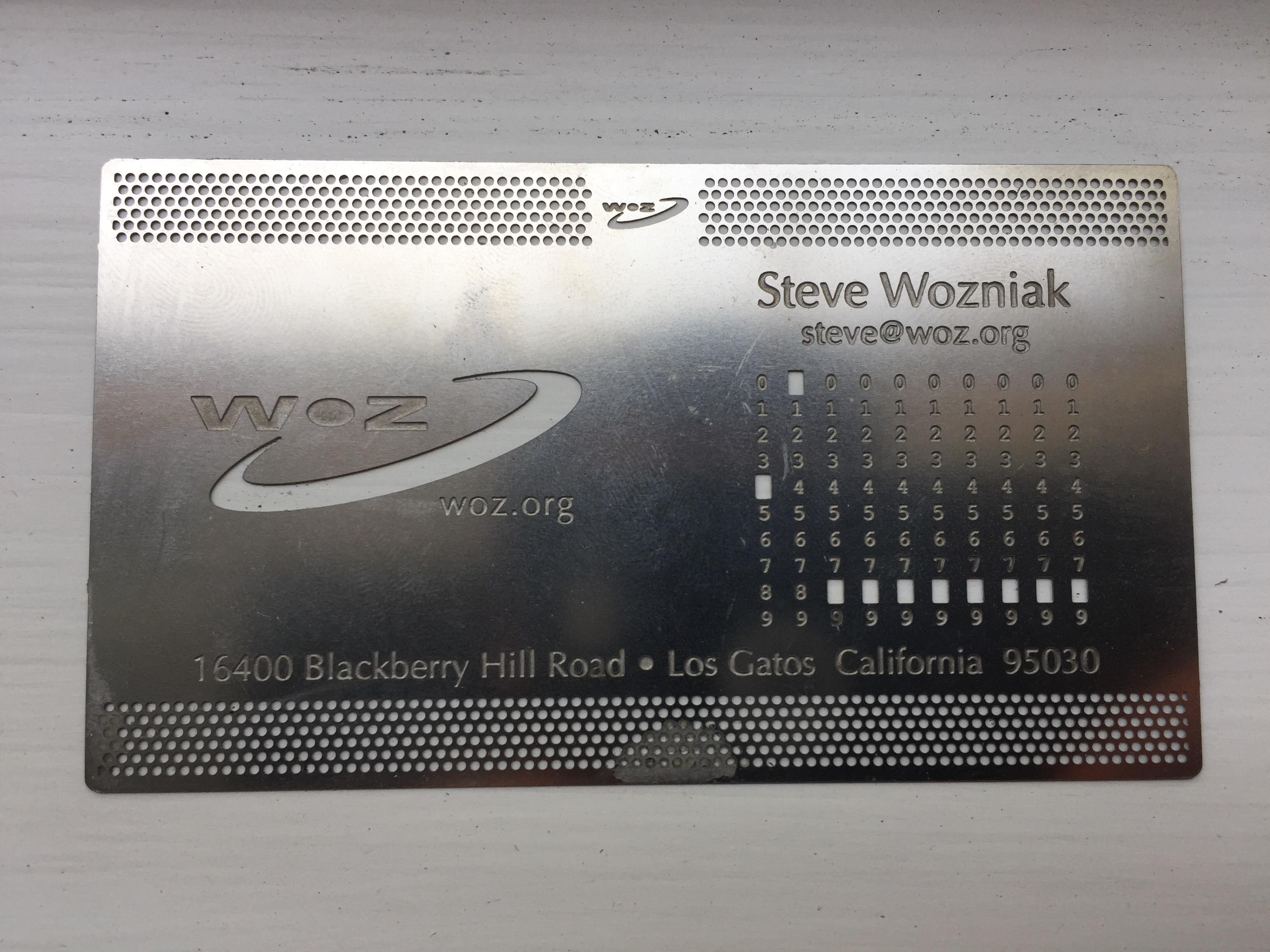
Steve Wozniak is one of the most famous figures in the world of computers, so what better card material for an electronics engineer than metal? The card is simple, creative, and evocative, and seems to be a perfect match for its owner. Sometimes you just have to play to your strengths!
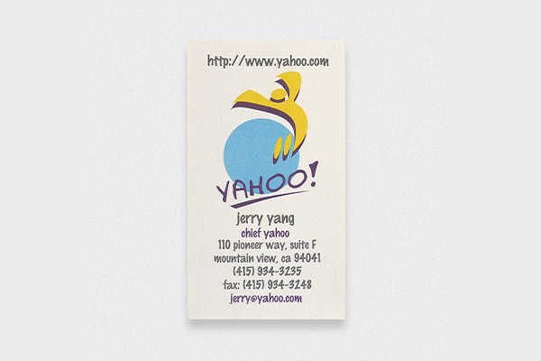
Evan Williams’ Twitter card is juggling a lot of great design choices at once. First, this card really wants you to recognize and remember the brand, and it has a simple, large logo that presents the only color on the card. It’s the first thing that grabs your eye. The minimalistic font and content choice not only gives you the relevant information, but also plays to the strengths of his business. The twitter handle and the text instruction are prevalent to his business, and can even demonstrate his business better than the card can. The minimalism of it all also draw attention to the card’s material, which looks recycled.
