I don't know about you but I am a visual learner. Unfortunately for me, this has led to an addiction – an addiction to infographics. I know, I know, they're everywhere; right? If we aren't drowning in infographics, we’re hanging on to our barcode-shaped life rafts with everything we've got.
Let's face it, imagery and exclusivity sell products. However, I've come to believe that printing plastic cards and the proper utilization of infographics can make those promotional life rafts unnecessary; it's all in how you use them.
It Begins with the Briefest of Histories
Let's start where any visual learner would; with the briefest of histories on multimedia marketing.
The world is full of visual communication methods. From petroglyphs to hieroglyphs and masterworks to pictograms; pictures have always had a place in this great and spinning universal narrative. It wasn't until 2005, that the patchwork narrative went viral.
In the early days of social media, when sites like Digg and Reddit became popular and blogging became a national pastime, people began looking for multimedia solutions that would generate traffic, hold the attention of an audience, and liven up stories and posts.What started with a photo developed into pictures with video support.
Pretty soon, the graphics had evolved to include influences from across the media. Sites that used these solutions saw viewings increase by 20%, and depending on how many graphics they used, the viewings shot up past 77%. Before long, you could tell a story on the Internet using nothing but statistics and pictures.
That brings us to where we are today (I told you the history was brief, didn't I?). A society so saturated with infographics that we use them to connect and present information on:
- Public relations
- Small business strategies
- Returns on investments
- Social media content
- Content marketing
- Blogging and storytelling

It's time to ask ourselves a hard question: Can we do better?
10 Tips for Developing Better Infographics
I would argue that for the betterment of your company, you should try to improve your infographics. To that end, if there were 10 Commandments for infographics, these would be strong contenders:
Commandment #1: Before you publish, perform the kiss test. Kiss stands for keep it simple, stupid. Make sure you haven't made a simple presentation more complicated. Overly complex information does not translate well to infographics. Evaluate your content to make sure you've chosen the right presentation format for it.
Commandment #2: Get a fact checker. Nothing causes the death of your credibility faster than incorrect or misspelled information. Always fact check and proofread before the content goes live.
Commandment #3: Where visual communication is concerned, design matters. Even though you're primarily presenting information don't forget about:
- Headlines
- Font choice
- Page layout
- Use of whitespace
Strong design attracts the eye. The eye absorbs the information.
Commandment #4: Color is your friend. You don't have to be an expert in color theory to use color successfully. It helps to know a little bit about the emotions certain colors convey, but your biggest ally in color choice is your gut and the first impressions of a test audience. Use both of these tools if you want to employ colors wisely.
Commandment #5: Remember the math rule. Mathematically, there is no right or wrong answer. There is only a right answer and a wrong answer. Make sure your statistics add up.
Commandment #6: The graphics should always enhance the narrative. A good story is made better with good visuals to go with it. Bad or mismatched graphics will only detract from the quality of your story or the value of your presentation.
Commandment #7: Use text sparingly. Graphically, a few words go a long way. Focus on essential information and use your words to make the story being told more compelling.
Commandment #8: Size equals quality. Compress your image files to the smallest possible size so they download quickly, but retain the image quality.
Commandment #9: There is such a thing as too much of a good thing. Use graphics sparingly. Put them in a few key locations or on your most important landing pages, but not on every post, every time.
Commandment #10: Avoid plagiarism at all costs. Multimedia presentations are part of establishing credibility too. Always credit your infographics sources so that your credibility is never in question.

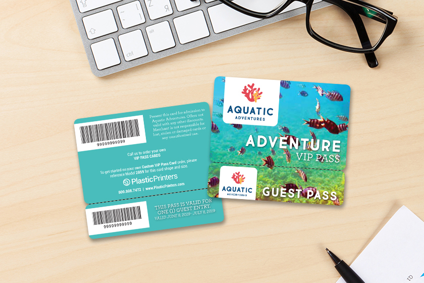
Now, here's the fun part: take every commandment listed and change the word "graphics" "or infographics" to "printing" or "printing plastic cards." Like a reversible coat; these promotional rules are interchangeable. After all, a plastic card is like a portable infographic for your business.
Use these guidelines to draft your next business card idea. Enter that idea into the artwork tool on our website: www.plasticprinters.com or contact us to talk about finalizing your design and printing plastic cards.